


Why Raised Texture Cards Create a Lasting First Impression
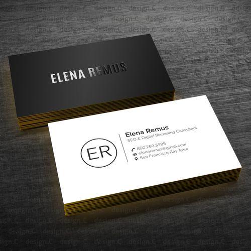
The business card exchange is a ritual. It happens at networking events, after meetings, and in chance professional encounters. In that brief moment when a card changes hands, an impression is made. Most cards are glanced at and pocketed. Some are genuinely noticed. Very few are truly remembered. What separates the remembered card from the forgotten one is often something you feel before you fully see it. Texture.
The Psychology Behind Tactile First Impressions
Human beings process sensory information simultaneously. Visual and tactile information arrive together and are interpreted together. This means how something feels directly influences how it is visually perceived. A card that feels premium is seen as premium. The two sensory channels reinforce each other powerfully.
Psychologists who study haptic perception, the sense of touch, have consistently found that texture influences value judgments. Objects with interesting tactile qualities are rated as more valuable and more memorable than smooth, texturally neutral objects. This applies directly and powerfully to business cards.
Why the Brain Encodes Tactile Experiences Differently
Touch activates brain regions associated with emotional memory more directly than vision alone. When you hold something with an interesting texture, you are more likely to remember it. This neurological reality has significant implications for business card design.
A card that creates a memorable tactile experience is not just noticed in the moment. It is retained in memory more reliably. When that person encounters your name later, the memory of the card experience resurfaces. That residual impression influences how they perceive you professionally.
What Makes a Card Genuinely Tactile
Not all textured cards are created equal. There is a difference between a card that is merely rough and one that creates a refined, deliberate tactile experience. The best textured cards communicate intentionality. Every surface quality feels chosen rather than accidental.
Raised texture is particularly effective because it is actively discovered. A recipient runs a thumb across the card surface and feels the elevation of embossed elements. That moment of physical discovery creates a small surprise. Surprise triggers heightened attention and memory encoding.
Categories of Raised Texture in Premium Card Design
Several printing techniques create raised or three-dimensional effects. Embossing presses a die into the back of the card, raising elements above the surface. Letterpress printing, while technically creating an impression, can leave ink sitting slightly raised on uncoated stocks.
Thermography is another technique that creates raised text by applying a special powder before heating. The result is a classic raised print effect used extensively in formal stationery. Each technique creates a slightly different tactile quality with distinct aesthetic associations.
The Unique Sophistication of Blind Embossing
Of all the raised texture techniques available, blind embossing occupies a special position in premium card design. It creates raised, three-dimensional elements with no ink, foil, or color applied. The raised surface is revealed entirely through light and shadow.
The subtlety of blind embossed business cards communicates a particular kind of confidence. It suggests that the brand is secure enough not to shout for attention. The embossed detail rewards close examination. Those who notice it appreciate it deeply. And those who appreciate subtle luxury are often exactly the clients most worth impressing.
When Subtlety Outperforms Boldness
In professional contexts, restraint is often more powerful than exuberance. Subtle sophistication communicates that you understand your audience. It says you are not trying too hard. This quality is enormously appealing to discerning, high-value clients and professional contacts.
Blind embossing achieves this balance perfectly. It is undeniably distinctive. But it never overwhelms or feels excessive. The person holding the card senses quality immediately. They discover the craft gradually. That two-stage experience, immediate quality impression followed by discovered detail, is exceptionally effective.
How Raised Texture Communicates Brand Values
Every physical quality of your business card communicates something about your brand. Texture communicates substance, depth, and quality. A card that feels solid and three-dimensional suggests that your business has those same qualities.
For professionals in consulting, finance, law, architecture, and luxury services, this alignment between card quality and service quality is critically important. Clients in these sectors are sensitive to signals of quality and professionalism. A premium card immediately signals that you belong in the premium tier.
Texture Tells a Story Before You Say a Word
Consider what happens when a prospective client receives two cards from competing professionals. One card is standard flat stock. The other features blind embossing on the logo and soft-touch lamination on the surface. Before either professional speaks, the second card has already communicated more.
It has communicated attention to detail. It has communicated investment in quality presentation. It has communicated that this professional does not cut corners on their own representation. These are exactly the qualities clients want in a professional they are considering hiring.
Matching Raised Texture to Card Composition
Raised texture works best when it is applied to design elements that deserve emphasis. Your logo, monogram, or a key geometric element is usually the best candidate. Raising these elements gives them prominence beyond what ink color alone can achieve.
Consider the visual relationship between embossed and flat elements. Raised areas draw the eye naturally. Everything surrounding them recedes comparatively. Use this visual dynamic deliberately to reinforce your intended design hierarchy.
Combining Multiple Texture Techniques Effectively
Some of the most impressive business cards combine multiple finishing techniques thoughtfully. A matte laminated surface provides a sophisticated backdrop. A blind embossed logo rises from that surface elegantly. A foil-stamped name adds precise, brilliant contrast.
Each technique adds a distinct layer of sensory interest. But discipline is essential. Adding too many competing textures creates chaos rather than sophistication. Choose techniques that complement each other. Ensure each serves a distinct purpose within the overall design.
The Role of Paper Weight in Raised Texture Cards
Raised texture requires appropriate paper weight to perform correctly. Very thin stocks do not hold embossed impressions well. The paper may buckle or crack rather than deforming cleanly into the raised shape. Heavier stocks provide the necessary rigidity and surface area for clean embossing.
Most embossed business cards use stocks of at least 16pt thickness. Double-thick laminated stocks, which bond two layers of card stock together, provide exceptional rigidity. The combined thickness feels remarkably substantial in hand. This extra weight amplifies the premium impression significantly.
How Paper Grain Affects Embossing Quality
Paper grain direction matters in embossing quality. Embossing across the grain can create cracking in the paper surface. Professional embossing specialists account for grain direction in their die creation and pressing process. Working with experienced printers ensures these technical factors are managed correctly.
The finish of the paper surface also affects embossing appearance. Smooth surfaces create crisp, sharp embossed edges. Textured surfaces create softer, more organic embossed impressions. Choose based on whether your brand calls for precision or warmth.
Practical Investment Considerations
Premium texture finishing does cost more than standard flat printing. That is simply honest. But the investment should be viewed strategically rather than as mere expense. Your business card is often the only physical representation of your brand that a prospect takes away from a first meeting.
The cost difference between a standard card and a premium embossed card is typically modest per unit. When ordered in professional quantities, that difference shrinks further. Compared to the potential value of a client relationship, the incremental investment in premium card quality is extraordinarily efficient.
Calculating the Return on Textured Card Investment
How many premium clients would justify the additional investment in textured cards? For most professionals, the answer is one. A single client relationship gained because your card was remembered rather than discarded pays for thousands of premium cards many times over.
Consider also the retention rate of premium cards versus standard ones. People keep cards that feel and look exceptional. They file them, photograph them, and refer back to them. A card that stays in a prospect's possession is a card that continues marketing for you indefinitely.
Conclusion
Raised texture cards create lasting first impressions because they engage more senses and trigger stronger memory formation than flat cards. They communicate brand values through physical quality that words and images alone cannot convey. In a professional world where everyone carries a card, texture is often the decisive differentiator.
Invest in understanding the full range of raised texture options available. Work with professional printers who specialize in these techniques. Design with texture in mind from the beginning, not as an afterthought. The result will be a card that represents your brand at its absolute best, one that people remember long after the meeting ends.


 English
 Arabic
 French
 Spanish
 Portuguese
 Deutsch
 Turkish
 Dutch
Dutch
 Italiano
 Russian
 Portuguese (Brazil)
 Greek
Greek